Showing posts with label Digital Paint. Show all posts
Tuesday, March 12, 2013
End of Art 2
So I know it's been a long time since I posted on my blog. But I do want to catch up. So! Art 2...months ago. Above is a picture of my character creation! We had to do a front, back and side view (with proportion lines, which I turned off for this picture) as well as a demographic change. That's what the little powerpuff-looking girl is there. A demographic change is basically a version of your character which is more geared to a different audience than your current character. I chose to do a demo change for a younger audience. Underneath is my original concept for the character.
We also had to do an environmental concept to match the character. The point of this is because we ended up doing a whole storyboard with our environment and character. Above is my environment concept, which was deeply inspired by the Secret of Kells. Really good movie, phenomenal animation.
My rough storyboard:
My final storyboard:
So there you have it! The final product of my Art 2 experience! And my final grade was 98.94% Yay me! Overall, I enjoyed the class, though the storyboard was very challenging with the time constraints.
Wednesday, December 5, 2012
Art 2: The first two weeks
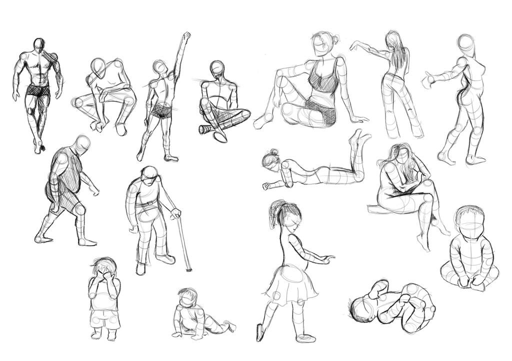
So this month, we started off with some figure drawing. Surprisingly, the majority of students in the class had never really worked with gesture drawing before, myself included! Above are some of my gestures from the first project's exercises. Here are some cat gestures that I did for another exercise:
But the real project was to deconstruct, repose, and reconstruct some characters based on our new knowledge of gesture work and the use of construction shapes. The shapes are extremely useful for posing because they help you to maintain the proportions and volumes of the different parts of the body. This is very important in making your character more dynamic and believable.
First we started off simple. It was a good place to start because it really gave me a feel for the use of construction shapes and how to pose. I didn't get it quite accurate yet, but it was a start.
Here are the others.
I spent a lot of time improving and refining the super hero woman, as my instructor advised, and here was the final result:
So that was that project. The way the projects are graded in Art 2 is sort of like a game to me. It's graded in tiers. There is the "base line" level, the "novice" level, the "proficient" level, and finally the "advanced" level. So the exercises and simple character re-pose were base-line for this project. Then the little guy I did was my novice level. The hero was proficient, and the sculpture was advanced. (I personally thought the superhero was harder but that's just me.) The thing is, you are only graded up to 70 points for base line, up to 79 for novice, 89 for proficient, and if you can finish the advanced level, you have a shot at getting your 100%.
Of course I will treat it as a game! A challenge! Well, I did it and I got a 99% baby!
....
Week 2's project was a nightmare for me! First of all, I didn't leave myself enough time to really work on it. I should have started early since it was a texture based project, and I am horrible at textures. But I guess I was too busy eating turkey and mashed potatoes or something.
The object this week was to analyze different animals and their anatomy and then mesh them together into a believable "creature."
I chose a black-necked stork, a squid and a green sea turtle. Firstly, we were instructed to do some studies on our chosen animals. Here are mine:
Next, we had to do some texture swatches to practice for our final drawings. Here are my tentacles and turtle flippers:
We also had to do some texture studies for our proposed creature's environment:
We also did a few different concept drawings for our creature, but I will just show you my final. So if you ever wanted to know what it would look like if a stork and a turtle made babies and it somehow mutated and merged with a squid then.....drum roll please...!
And there you have it! A Squea Torkle! And for this one I got a 97! Not bad, considering I was really floundering over this one. (Semi-pun was semi-intended...)
Now this week we are doing character creation. Want a sneak preview? Here are the character concepts I've got going on so far:
She's a wild druid woman, living amongst the trees and searching for someone very dear to her. I think I'm going to go with a final version most like the middle concept. I'm having a lot more fun with this project than the last! Can't wait to show off the end results! (I am so going to try modeling my character in Maya during winter break if I have a chance!)
Monday, October 29, 2012
Art 1 Conclusion
Final grade for Art 1: 100%!!!!!
Yay! My first perfect score! And many more to come. I am so glad I decided to go to Full Sail online. I am totally in my element here. It leaves me with an unknown future, as there are no game companies around here, but I am going with the flow. Who knows, since I'm doing so awesome, maybe I'll make a totally hit indie game and rocket launch my career in the middle of my schooling and not have to go anywhere. It could happen. I won't prevent it, that's for sure.
To further my boasting, not only did I get a perfect score this month, but I also got the Course Director's Award for my class in Art 1! Not entirely sure what that means, but I am overly proud of it. I tried really hard in my art class, okay?!?!
Anyways, the above image is my final project in all of it's glory...Haha, just kidding...about the glory part. It is my final project, though. I like the way it turned out a lot! My least favorite one is the busy Times Square one. But oh well. It's good. I got a 100%. So it is good.
Okay, back to work for me! Got some 3D modeling to learn!
Friday, October 19, 2012
Decisions, Decisions...
So I am having a hard time deciding what to do for my final project in Art 1. It's a perspective project, so I need to create depth through either linear perspective or atmospheric perspective, or both.
Originally I wanted to do a sort of fun, whimsical cartoon-ish digital painting. It turned out something like this:
I mean, I like it, but I don't... I want to finish it...but I don't. I don't know. I just don't feel like it's great for this week's project. I like it, but not for class, I guess is what I mean.
So I decided to go more for realistic. I have started trying my hand at digital "speedpainting." It's not quite that speedy yet. Took me about 3 hours. But it looks pretty darn awesome, in my opinion.
Unfortunately for my sense of having a life, this is meant to be a part of a four-piece set. I have to go out with a bang, right?!
Monday, October 8, 2012
Art 1: Project 2
This is my second project for Art 1! I am pretty pleased with it, and it was a lot of fun to make. We were instructed to portray a scene with drama and emotion without the use of value or anything like that. Only line and shape in black or white.
I don't know why I chose this particular scene. It just sort of popped into my head when I was trying to come up with an idea for the project. So I just went with it. Creating the actual figures in the image was pretty easy and didn't take very long. The part that I spent the most time on was in rearranging everything and adjusting the size and shape of things to create a well balanced composition.
I most wanted to capture the feeling of fast movement in this piece. So I hope it travels your eye around and about the picture quite quickly. I know it does mine but maybe that's just because I've been staring at it for days and I'm constantly looking for things to change or improve.
Thursday, October 4, 2012
Project 1...Finished!
Whew! I was working on this damn still life for about four days straight. Glad to be done with it...
The fabric was fun to do on the left, frustrating to do on the right. The camera also gave me a bit of trouble, but the detailing was actually pretty fun to do. I think the hardest part was the texture on the little statue. But all in all, I'm pretty pleased with this.
I just realized I haven't signed this. I need to come up with a nifty artist signature...
Saturday, September 29, 2012
Project 1 Progress
I am getting so tired of this painting...Hahaha..
It's going well though. I am glad I chose digital painting for my medium for this project. I've been wanting to learn how to paint in Photoshop for quite some time now and this project has been teaching me very fast how to blend properly, how to get colors, how to use hotkeys...
I am enjoying the composition of this image at the very least. Good movement, good contrast, everything I've been learning in class this week I have employed well I think.
Man, oh, man my hands are cramping though. And it may have too much contrast because my eyes are bugging out after staring at those bright green leaves all night.
Dreading the camera because it's pretty complicated, but hopefully I'll have that started tomorrow.
Thursday, September 20, 2012
My Art History Work
My second class at Full Sail, Art History, had two digital painting projects. The first was a digital cave painting from scratch. The second was a digital pop art painting from a photo of yourself.
So it may not look like much but I actually learned a lot from this painting. I learned how to create a textured background by adding a texture to the light rendering. Photoshop has nice lighting effects, actually. I also experimented a little bit with creating brushes, which I am getting pretty good at now.
This painting was actually completely invented by me. I went out on a limb and didn't follow the instructions for the actual assignment, which was just a basic photomanipulation to look like Andy Warhol's screen print works. Instead, I did a vector painting with the pen tool and then manipulated the colors and stuff. I also halftoned the skin color to sort of mimic Lichtenstein's comic book art.
So anyways, I finally got the OK to share my work online from Full Sail. So I will be putting up all of my art for school on here from now on. Yay!
Monday, September 10, 2012
Fauvism
That portrait I was painting last night of Evelyn got painted over...Matisse style! (No I didn't actually save over it.) But here is my fauv version of Evelyn. I was learning about expressionism in my Art History class and was so overwhelmed with inspiration that this happened. :)
It was really interesting to experiment with colors in a way I never had before. I really challenged myself to not use black or white and the result was pretty fun. I know the hair looks pretty lame but I was mostly concerned with depicting the face and skin tones in new ways. I also challenged myself to use as many colors as possible. I know that doesn't necessarily mean fauvism, but I was just having fun. :P
Inspiration:
Sunday, September 9, 2012
Digital Paint WIP
Well, I have been doing a lot of "research" on how to blend digital paints and stuff like that. So I am finally sort of getting the hang of it. I got some semi-smooth transitions in there.
I have also been having a LOT of fun making different brushes to play with. I really like the more speckled brushes for painting portraits than the smooth, soft brushes. It gives the skin more texture and more character.
Anyways, hopefully I will end up finishing this at some point. Apparently digital paintings take HOURS. So I am throwing in the towel for tonight.
Sunday, September 2, 2012
Evelyn
Meet Evelyn. Full name: Evelyn Marietta Von Tessa.
She is my new original character for art practices. I will be using her to try out all kinds of artistic styles. This way I can compare different art styles more easily. Knowing that each picture depicts the same person will make it easier to distinguish the various elements of a particular art style that make it unique.
So Evelyn will be a basic semi-gothic character. And by that I mean that she is probably closer to being from the Victorian era than the Gothic era.
She has dark, long, wavy hair. Sleepy grey-violet eyes. Her favorite color is burgundy. Fair skin.
Evelyn is likely to be the first of many original characters that I create. To the right is just a quick sketch of her in my...normal realistic style. It's not great or anything, but I just wanted to create an appearance for her.
So anyhow, treat her kindly and watch out for more of her on my DeviantArt channel!
Monday, August 27, 2012
First Attempts
I've always started trying to learn digital paint by going into a full on portrait of someone. That's silly. We start with stick figures. Or...well, I decided to start with a candle.
This was an experiment with paint brush "flow." The percentage of flow is basically how easily the paint comes off the brush. It's like opacity but slightly different. I love how it can create a "soft" effect. It will be really useful for making things glowy for example. That's why I tried out a candle.
I know, I know. It's pretty sad looking. But it was just for practice and really just to test out varying levels of flow and opacity with different brush hardnesses. I've figured out that a softer brush will create a more glowy effect. Also there is not much use in a hard brush with a low flow. It just makes things look messy. That's why the actual candle part itself looks so...sloppy.
Anyways, here it is. A....pretty picture?
Friday, August 17, 2012
i would just like to say...
This thing is awesome. It's the Wacom intuos 5 touch tablet. I can't wait to mess around in Photoshop with it. I've always wanted to learn how to digitally paint, though I was never any good at it. Now that I have this bad boy though, perhaps I'll be motivated enough to keep trying.
Subscribe to:
Posts (Atom)